Bot Advisor
Welcome to the official documentation for the QuantiX Bot Advisor. This comprehensive guide details the structure, interactive modules, and graphical reports that compose the Bot Advisor environment, enabling users to find, audit, and compare trading bots that match their unique preferences.
1. Introduction: What is Bot Advisor?
The Bot Advisor is an advanced analytics and decision-support tool tailored for QuantiX users. Its primary purpose is to bridge the gap between abstract algorithmic performance and practical portfolio construction.
In quantitative trading, evaluating a bot solely on its raw historical returns often introduces structural vulnerabilities, such as over-optimization (curve fitting) or hidden drawdown risks. The Bot Advisor tool solves this by providing a standardized, multidimensional benchmarking interface. It aggregates live tracking data alongside historical simulations, allowing users to contrast real-world execution against backtested parameters across a diverse roster of trading algorithms.
2. Ranking Table
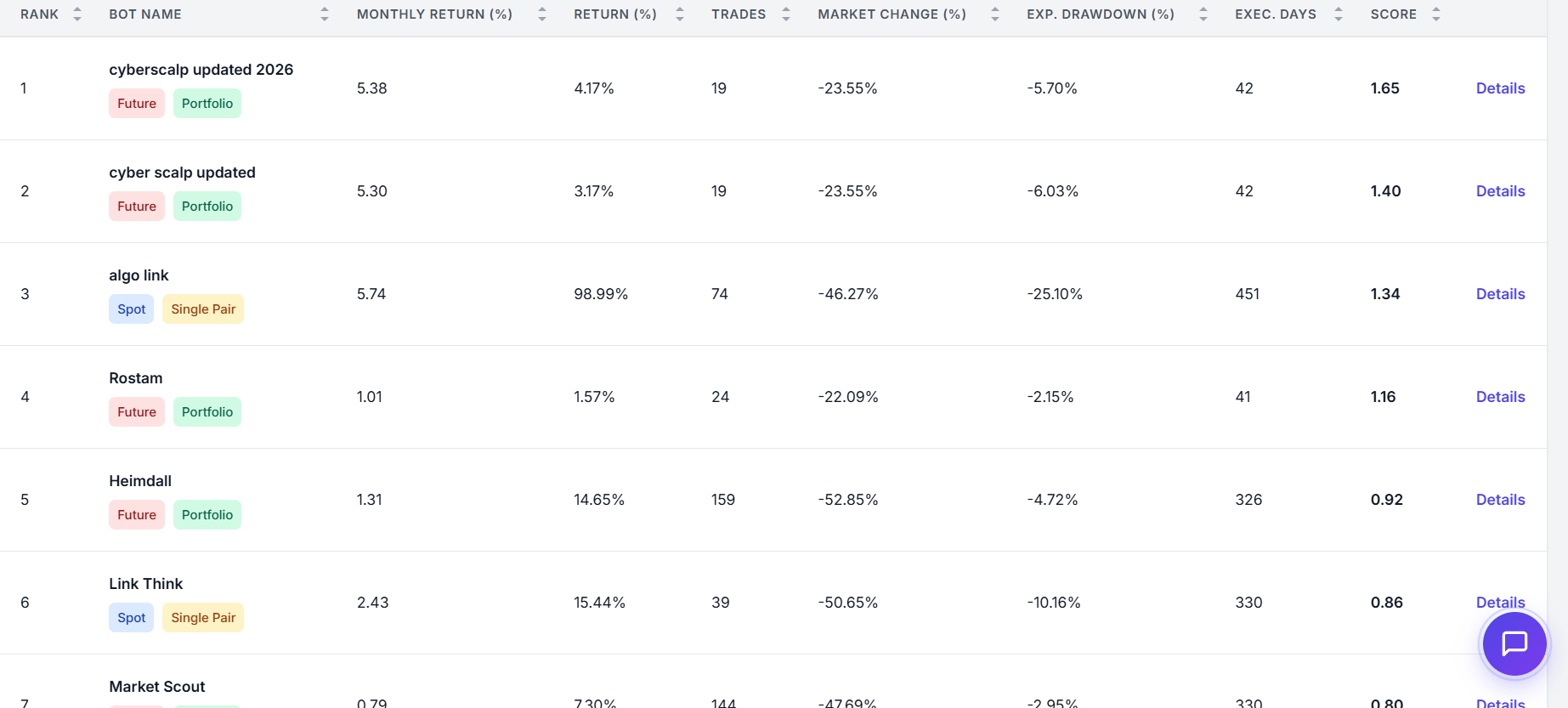
The Ranking Table is the central data core of the Bot Advisor dashboard. It dynamically benchmarks and ranks every algorithmic strategy within the QuantiX ecosystem using a comprehensive multifactor scoring formula. By combining raw performance data with risk constraints, it ensures that bots are listed based on true capital efficiency rather than raw, reckless returns.
The Bot Ranking Formula
The table calculates a unified Score for each bot using the relative
The weighted formula is structured as follows:
Profitability & Reward (60% Total Weight): Balanced equally between raw output (
on Monthly Return) and risk-adjusted volatility efficiency ( on Sharpe Ratio). Downside Stability (40% Total Weight): Incorporates intermediate risk-adjusted tail management (
on Calmar Ratio) while penalizing major structural mistakes by subtracting points for peak peak-to-trough drops ( on Max Drawdown) and capital stagnation periods ( on Recovery Time).
Table Controls & Filters
Located directly above the dataset is the table configuration row. Adjusting these parameters filters the table records specifically:
MARKET TYPE: Toggles the visible rows between Spot (asset ownership), Future (leveraged/derivative contracts), or All Markets.
STRATEGY TYPE: Organizes row outputs by specific structural architectures:
Portfolio: Strategies managing a diversified multi-asset basket simultaneously.
Single Pair: Algorithms operating strictly on a single isolated pair (e.g., BTC/USDT).
All Strategies: Merges both structural layouts into a unified leaderboard view.
ENVIRONMENT: Filters the table rows based on the specific server clusters or infrastructure pipelines where the bots are actively deployed (e.g., Stable vs. Stage servers like Alborz or Zagros).
ASSETS: A selective dropdown to isolate bots in the table whose strategies actively trade specific digital assets (e.g., BTC, ETH, SOL).
DATA TYPE (Live / Backtest Toggle): Selects the underlying source of the displayed table rows:
Live: Populates fields using verified, real-time forward execution data.
Backtest: Populates fields using simulated historical optimization data.
EXPORT TO CSV Button: Allows users to download the filtered leaderboard and its current statistical columns into a flat file format for localized spreadsheet or data analysis.
Data Columns Definition
RANK: The chronological positioning of the bot based on its final aggregated Score.
BOT NAME: The unique identifier of the algorithm, accompanied by quick tags highlighting its market class (
Spot/Future) and operational layout (Portfolio/Single Pair).MONTHLY RETURN (%): The annualized average monthly run rate.
RETURN (%): The absolute total percentage return generated over the entire deployment window.
TRADES: The cumulative volume of positions opened and closed.
MARKET CHANGE (%): The price movement baseline of the underlying asset over the same time frame, acting as a benchmark control.
EXP. DRAWDOWN (%): The expected peak-to-trough equity drop experienced by the strategy.
EXEC. DAYS: The total number of consecutive calendar days the bot has been actively running and tracking data.
SCORE: The final mathematical value derived from the multifactor
-score formula. DETAILS: An interactive shortcut link to expand the chosen bot's granular configuration and execution log files.
3. Graphical Reports
Beyond tabular arrays, the Bot Advisor features an extensive catalog of Graphical Reports. Looking at raw metrics in a table can mask dangerous behavioral correlations, structural drift, or capital inefficiencies. The added value of these visualization engines lies in their ability to:
Expose Strategy Drift: Instantly illuminate the delta between historical backtest expectations and raw live execution reality.
Compress High-Dimensional Statistics: Convert complex, multifactor trade logs (win rates, payoff ratios, market exposure intervals, and frequencies) into geometric profiles that can be safely audited in seconds.
Prevent Over-diversification Redundancy: Highlight whether multiple selected bots are moving in perfect lockstep, thereby creating accidental portfolio concentration risks.
Bot Selector Module
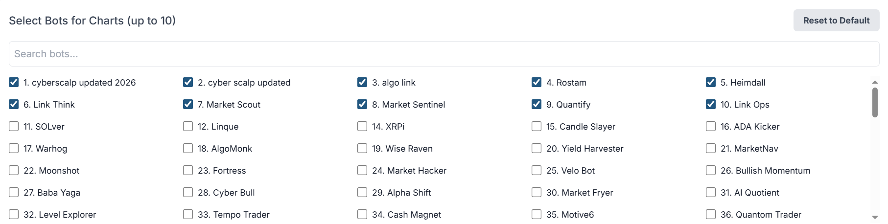
The Bot Selector is the core interactive control panel located directly above the dashboard’s graphical reports. It allows users to dynamically choose exactly which algorithmic trading strategies they want to isolate, compare, and overlay across all the visual charts on the platform.
Controlling Elements & Interaction Options
Search Bar ("Search bots..."): A real-time text input box that filters the checkbox list down instantly. Users can type specific keywords or strategy prefixes (e.g., typing "cyber" or "link") to locate a bot without scrolling through the full database.
Multi-Column Selection Checkboxes: A comprehensive grid listing every available bot deployed within the QuantiX ecosystem, complete with its rank number and canonical name.
"Reset to Default" Button: Instantly clears all custom user selections and restores the dashboard's default baseline bot profile overlay.
How to Use the Bot Selector Efficiently
Uncheck Unwanted Assets: Clear room on your 10-bot limit by unchecking any default active strategies you do not wish to evaluate.
Isolate an Archetype Class: Use the search bar or filters to bundle similar bots. For example, check up to 10 different "Scalper" variations to isolate and compare micro-execution styles side-by-side.
Watch the Charts Auto-Update: The entire dashboard is reactive. The moment a checkbox is selected or not selected, every single chart below instantly re-renders to process your new selection bundle without requiring a manual page refresh.
Risk & Performance Metrics (Live)
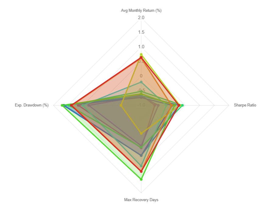
The Risk & Performance Metrics (Live) radar chart (or spider chart) provides a holistic, 360-degree visual snapshot of multiple selected bots overlaid simultaneously. It allows users to visually contrast a bot's reward metrics against its risk penalties on a single geometric layout.
Core Visual Elements
The Four Axes: The chart evaluates bots across four foundational dimensions:
Avg Monthly Return (%) [Top Axis]: Measures nominal baseline profitability. Higher is better.
Sharpe Ratio [Right Axis]: Measures risk-adjusted return efficiency. Higher is better.
Max Recovery Days [Bottom Axis]: Tracks the duration it takes for a bot to recover from its worst equity drop. Further outward means a longer, more painful recovery time.
Exp. Drawdown (%) [Left Axis]: Represents the expected peak-to-trough capital loss. Further outward means deeper capital drawdowns and higher downside risk.
Multi-Bot Overlay: Distinct, semi-transparent color polygons map individual bots.
💡 How to Interpret It
The "Top-Right" Lean (Aggressive / Efficient): A bot that stretches far toward the top and right axes, but stays pulled tightly inward on the bottom and left axes, is highly desirable. It means the bot delivers high returns and high efficiency with minimal risk exposure.
The "Bottom-Left" Expansion (High Danger): If a bot's shape balloons heavily toward the left (Exp. Drawdown) and bottom (Max Recovery Days), it represents a highly volatile or struggling strategy. Even if it reaches high on the return axis, an expanded bottom-left profile warns you that the bot takes massive, prolonged losses to achieve those gains.
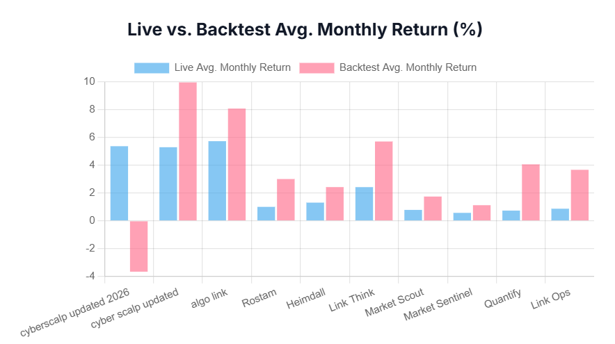
Live vs. Backtest Avg. Monthly Return (%)
The Live vs. Backtest Avg. Monthly Return (%) chart is a side-by-side clustered bar chart designed to audit structural strategy drift. It contrasts the idealized historical results of a bot with its real-world performance under active market conditions.
Core Visual Elements
X-Axis: Lists the specific names of selected trading bots.
Y-Axis: Displays the percentage return scale.
Blue Bars (Live Avg. Monthly Return): Represents the actual, realized average monthly percentage return generated by the bot in the live environment.
Pink Bars (Backtest Avg. Monthly Return): Represents the simulated, historical average monthly percentage return achieved during the bot's backtesting optimization phase.
💡 How to Interpret It
Expectation vs. Reality: Comparing the heights of the blue and pink bars for any given bot reveals whether it is living up to its design parameters.
Over-Optimization / Curve Fitting Warning: If a bot shows a massive pink bar (high backtest returns) but a tiny or negative blue bar (low/negative live returns)—as seen on the far-left asset—it heavily indicates an over-optimized backtest that is failing to adapt to live market regimes.
Consistent Outperformance: Bots where the blue bar closely matches or exceeds the pink bar indicate robust algorithmic designs that translate successfully into live market environments.
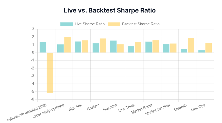
Live vs. Backtest Sharpe Ratio
The Live vs. Backtest Sharpe Ratio chart evaluates the risk-adjusted return health of the bots. It isolates whether the volatility a bot takes on during live trading is proportional to its performance compared to its historical simulations.
Core Visual Elements
X-Axis: Aligns with the same selected bots mapped across the dashboard for uniform tracking.
Y-Axis: Represents the standard Sharpe Ratio numerical scale (typically ranging from 0 to 3+).
Teal Bars (Live Sharpe Ratio): The realized risk-adjusted return efficiency score during live deployment.
Yellow Bars (Backtest Sharpe Ratio): The simulated risk-adjusted return efficiency score achieved during historical backtesting.
💡 How to Interpret It
Evaluating Volatility Efficiency: The Sharpe Ratio answers if a bot's returns are earned through smart positioning or excessive risk. A higher bar means higher returns per unit of volatility.
The Variance Gap: If the Teal bar is significantly lower than the Yellow bar, the bot is experiencing higher volatility or lower returns in live environments than its backtest accounted for.
If the Teal bar matches or nears the Yellow bar, the strategy is effectively managing risk and executing with stable, predictable volatility parameters.
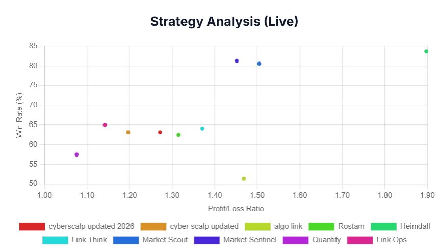
Strategy Analysis (Live)
The Strategy Analysis (Live) chart is a scatter plot that maps the statistical profile of each bot's execution style. By analyzing the relationship between how often a bot wins and its average payoff size, users can identify the core mathematical methodology of the algorithm.
Core Visual Elements
X-Axis (Profit/Loss Ratio): Measures the size of the average winning trade divided by the size of the average losing trade.
A value of 1.00 means average wins equal average losses.
Moving to the right (1.50 to 1.90+) means the bot captures much larger wins than its losses.
Y-Axis (Win Rate %): Measures the percentage of total trades completed in profit. This scale runs from 50% up to 85%+.
Color-Coded Plot Points: Each individual dot represents a specific selected bot.
💡 How to Interpret It
This chart categorizes bots into distinct algorithmic trading archetypes:
The "High-Precision Scalper" (Top Left): Bots sitting high on the Y-axis (75%–85% win rate) but lower on the X-axis (1.10–1.40 P/L ratio). These bots make money by being right most of the time, cutting trades quickly for small, frequent gains.
The "Trend Follower" (Bottom Right / Middle Right): Bots with a lower win rate (50%–65%) but a high Profit/Loss Ratio (1.50–1.90+). These algorithms tolerate more frequent small losses because when they catch a market trend, their winning trades are massive, easily overriding previous small hits.
The "Holy Grail" Quadrant (Top Right): Bots that maintain both a high win rate and a high Profit/Loss Ratio simultaneously. These represent highly optimized, dominant live strategies.
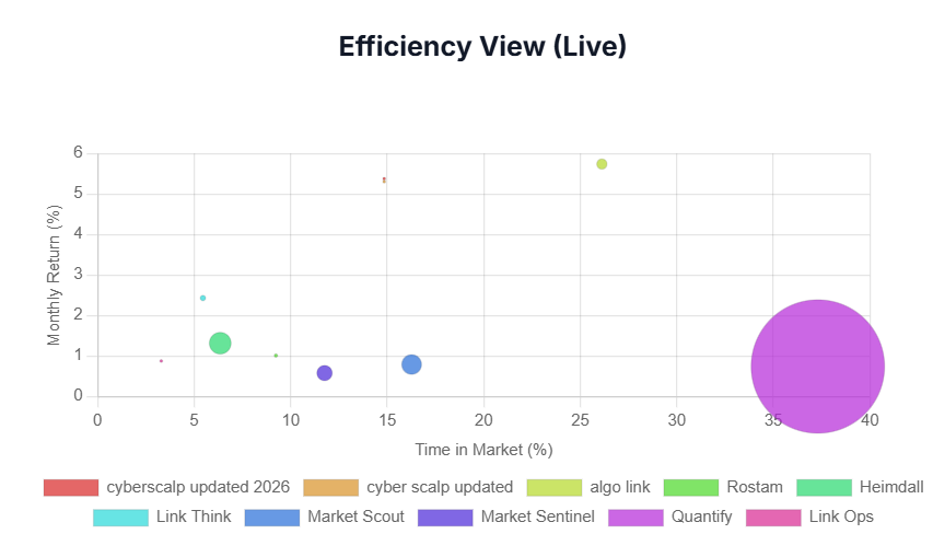
Efficiency View (Live)
The Efficiency View (Live) is a multidimensional bubble chart designed to visualize capital exposure efficiency. It answers a vital question: Is the bot generating enough monthly returns to justify the amount of time it leaves your money at risk in the market?
Core Visual Elements
X-Axis (Time in Market %): Tracks the percentage of time the bot holds an active position.
A bot on the left side (0%–15%) spends most of its time in cash.
A bot on the far right side (30%–40%+) is heavily exposed, constantly keeping capital active in live market positions.
Y-Axis (Monthly Return %): Displays the baseline monthly percentage return generated by the bot. Higher up means more absolute profit.
Bubble Size (Trade Frequency): The physical diameter of each bubble corresponds directly to the total volume of trades executed by that bot.
Massive Bubbles: High-frequency strategies running hundreds trades.
Tiny Dots: Macro or swing strategies that take fewer, highly selective entries.
💡 How to Interpret It
The Sniper Zone (Top Left / Small-to-Medium Bubble): Bots generating high monthly returns (5%–7%) while spending minimal time in the market (5%–15%). These strategies are highly capital-efficient; they safely park your funds in cash most of the time and strike only during key opportunities, heavily minimizing exposure to sudden market crashes.
The High-Frequency Grind (Right Side / Massive Bubble): As seen by the large purple bubble on the far right, these bots are constantly exposed to the market and trade continuously. While they compound volume, you must monitor them to ensure their high trade counts aren't accumulating excessive execution fees or slippage that eats into net performance.
The Inefficiency Warning (Bottom Right): Bots holding active positions for long durations (high market time) but flatlining near the bottom of the return axis. These strategies lock up your liquidity and expose your capital to systemic market risks without generating a high enough yield reward to justify it.
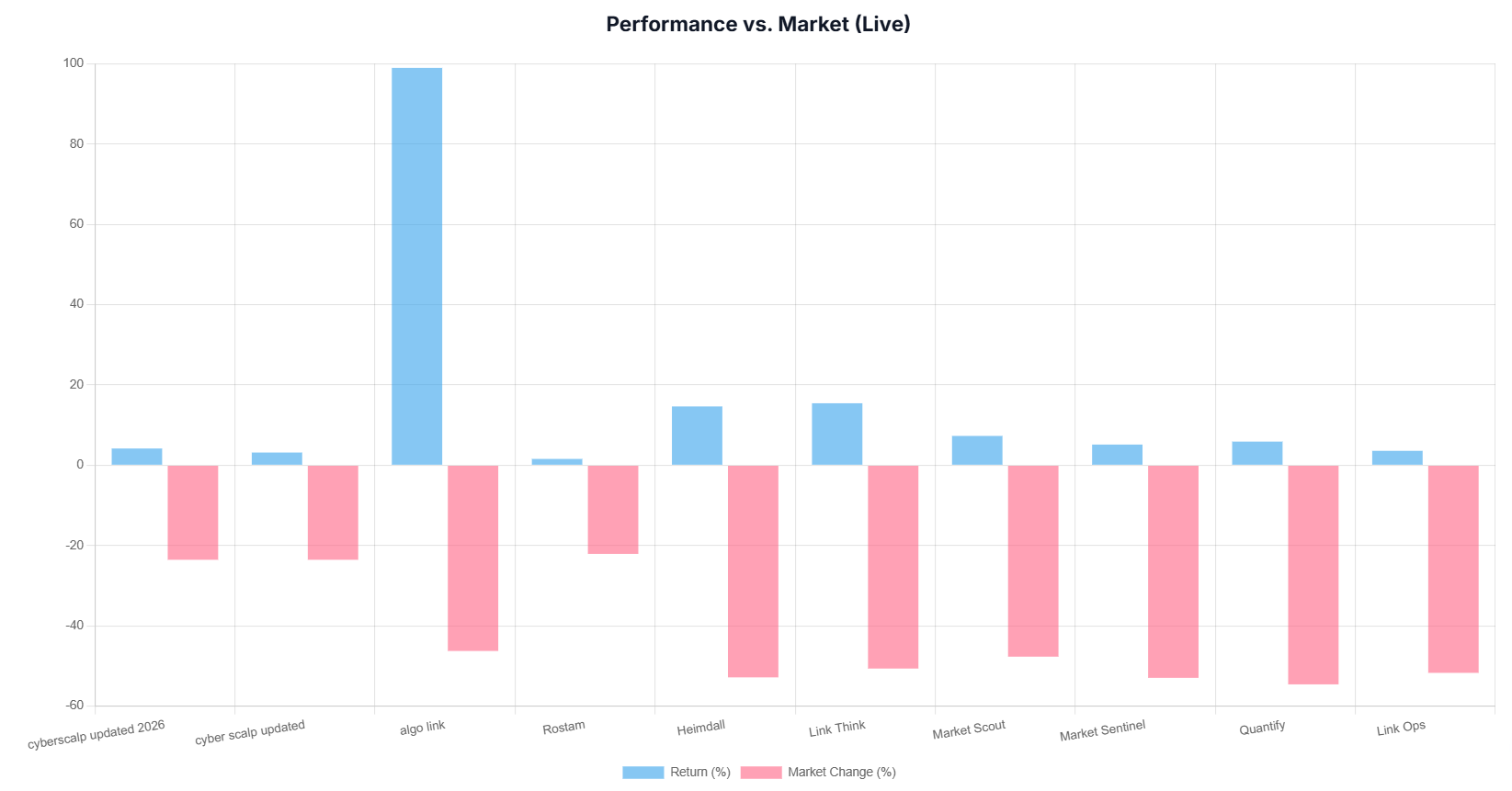
Performance vs. Market (Live)
The Performance vs. Market (Live) chart is a side-by-side clustered bar chart that provides absolute context on a bot's real-world value. It answers the fundamental quantitative question: Is this bot actually generating alpha (outperforming the underlying market baseline), or is its performance simply a byproduct of market trends?
Core Visual Elements
X-Axis (Bot Tracking Panel): Lists the individual trading bots selected from your main dashboard layout.
Y-Axis (Percentage Change Scale): Tracks performance metrics running from sharp negative baselines (-60%) up through positive exponential spikes (+100%).
Blue Bars (Return %): Represents the actual, realized live return percentage generated by the specific bot during its execution timeframe.
Pink Bars (Market Change %): Represents the benchmark performance or structural percentage change of the underlying asset market over that exact same tracking window.
💡 How to Interpret It
In live trading regimes, look for how the blue bars interact with the pink bars to identify these scenarios:
True Alpha / Market Decoupling (Blue Positive, Pink Negative): The blue bar stands upright in positive territory, while the corresponding pink market bar plunges deeply into negative territory. This proves the bot possesses powerful directional shorting mechanics, cash-hedging filters, or market-neutral strategies. The bot is actively making money while the broader market crashes.
Exponential Outperformance (The Massive Blue Spike): A blue bar that dwarfs its benchmark market change by multiples. This highlights an algorithm maximizing momentum, trend capturing, or leverage structures effectively.
The "Beta Rider" or Ineffective Strategy (Both Negative or Weak Outperformance): The bot's blue bar drops into negative territory alongside a falling pink bar, or barely outperforms a crashing benchmark. This indicates a bot that lacks effective downside protection or defensive switching protocols.
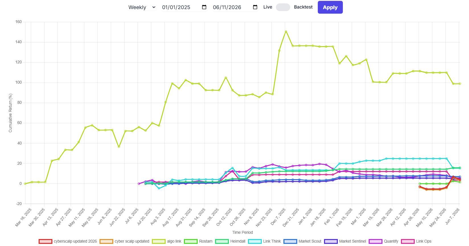
Performance Over Time — Multi-Line Equity Curve Chart
The Performance Over Time chart is a historical equity curve visualization that tracks the compounding growth and equity changes of your selected trading bots over a specified timeline. By mapping cumulative returns as continuous lines, it allows users to analyze momentum, drawdown recovery speed, stability, and long-term performance consistency across multiple algorithms simultaneously.
Controlling Elements & Interaction Panel
At the top of the chart is an interactive control bar that allows users to adjust the granularity, timeframe, and data source of the visualization:
Granularity Dropdown (e.g., "Weekly" / "Quarterly" / "Yearly"): Controls the data aggregation intervals plotted along the timeline. Switching to Weekly provides a detailed look at short-term volatility, while Quarterly or Yearly smooths out the noise to reveal macro performance trends.
Date Range Pickers (Start Date / End Date): Allows users to define a custom tracking window. This is useful for isolating specific market cycles to see how well the bots performed during those distinct phases.
Live / Backtest Toggle Switch: Changes the data set feeding the line graph between verified real-world forward-tested execution data (Live Mode) and simulated historical performance curves (Backtest Mode).
"Apply" Button: Commits any changes made to the configuration toggles, instantly re-rendering the multi-line chart below.
Core Visual Elements
Y-Axis (Cumulative Return %): Represents the total percentage return compounded from the bot's initial starting capital base.
X-Axis (Time Timeline): Tracks continuous time intervals moving from left to right.
Color-Coded Equity Lines: Each unique colored line maps the ongoing equity path of a specific bot. Lines that start later along the timeline reflect bots that were deployed or tracked at a more recent date than the baseline bots.
💡 How to Interpret It
The Consistent Compounder (Smooth upward slope): A line that steadily moves from the bottom left to the top right with minimal jagged dips or flattening periods. This represents a highly stable, lower-volatility strategy with reliable risk management.
The High-Volatility Outperformer (Massive spikes and deep V-shaped drops): A line that shoots up aggressively but is punctuated by sharp drop-offs and steep valleys. This highlights an aggressive trend-following or high-beta strategy. Users must be prepared to endure large equity swings (drawdowns) before new peaks are achieved.
Structural Flatlining or Decay (Horizontal or downward slopes): A line that transitions into a long, flat horizontal stretch or a slow drift downward. This indicates a bot that has lost its edge or is unsuited for the current market regime.
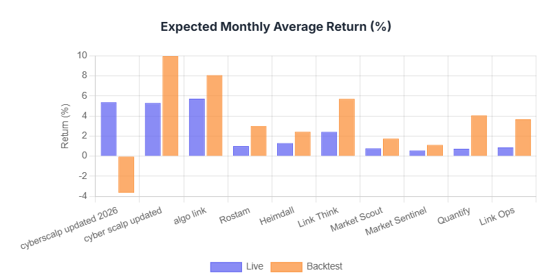
Expected Monthly Average Return (%)
The Expected Monthly Average Return (%) chart contrasts the annualized monthly run rate of the strategies, highlighting performance variations between backtested parameters and live runtime deployment.
Core Visual Elements
X-Axis: Lists the unique names of the tracked trading bots.
Y-Axis: Represents the average monthly return scale (running from negative values up through +10%).
Purple Bars (Live): The real-world average monthly percentage return achieved in live trading.
Orange Bars (Backtest): The idealized, historical average monthly return simulated during the bot's optimization phase.
💡 How to Interpret It
Performance Baseline: It sets the baseline expectations for portfolio compounding.
The Variance Gap: If the orange bar is exceptionally high but the purple bar drops significantly or dips into negative territory, it warns users that the bot is failing to recreate its historical success under current live market conditions.
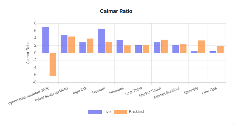
Calmar Ratio
The Calmar Ratio chart acts as a pure efficiency filter, analyzing a bot's absolute profitability relative to the drawdowns it forces your capital to endure over time.
Core Visual Elements
Y-Axis (Calmar Ratio Scale): Measures the specific relationship between average return and maximum drawdown over a set period.
Purple Bars (Live Calmar) & Orange Bars (Backtest Calmar): Map the shifting performance-to-downside efficiency across environments.
💡 How to Interpret It
The Calculation:
The Golden Standard: A higher Calmar ratio means a bot generates excellent returns while keeping its downside risks exceptionally well-contained.
Live Outperformance: If a bot exhibits a highly negative backtest Calmar (orange bar going down), yet its live performance shows a massive positive jump (purple bar going up), this indicates that the algorithm’s live risk-adjusted efficiency is far stronger than its historical test profile predicted.
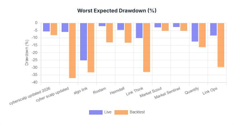
Worst Expected Drawdown (%)
The Worst Expected Drawdown (%) chart acts as your portfolio's defensive audit bar. It visualizes the worst-case structural capital dips observed or modeled for each bot.
Core Visual Elements
Y-Axis (Drawdown Scale): Runs downward into negative territory (from 0% down to -40%).
Bars Extending Downward: The further a bar stretches down toward the bottom of the chart, the more capital risk the bot exposes you to.
💡 How to Interpret It
Downside Boundaries: This chart tells you the exact financial pain threshold you must be willing to tolerate if you activate a bot.
Live Capital Protection: When the purple bar (Live Drawdown) is significantly shallower than the orange bar (Backtest Drawdown), it shows that the live algorithm is successfully mitigating risks and protecting your capital better than its historic worst-case parameters.
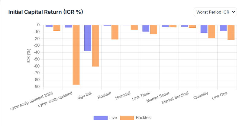
Initial Capital Return (ICR %)
The Initial Capital Return (ICR %) chart measures a bot's structural capability to return yields explicitly scaled to the initial starting capital allocation. It features a dropdown menu to slice the data across different statistical distributions.
Core Visual Elements
Dropdown Selection (Top Right): Allows users to toggle the visual layout between four unique metrics:
Mean ICR: The average capital return across the deployment lifespan.
Median ICR: The midpoint of capital returns, eliminating outlying extreme trading days.
Best Period ICR: The highest peak performance window.
Worst Period ICR: The single worst-performing capital window.
Y-Axis (ICR % Scale): Maps capital returns scaled directly to your principal.
💡 How to Interpret It
Capital Efficiency: Use this chart to quickly audit raw capital utilization velocity. A strong positive cluster of bars shows that the bot isn't just winning trades, it is actively growing the total capital base effectively.
Outlier Traps: Compare Mean ICR against Median ICR. If a bot boasts a massive Mean ICR but a flat or negative Median ICR, it means a few lucky, oversized wins are artificially masking a strategy that loses money on most normal trading days.
4. AI Advisor
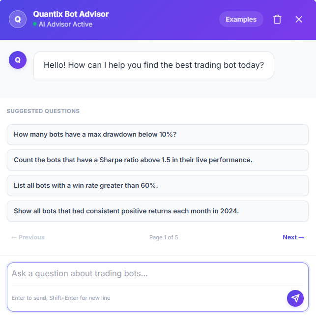
To cut you some slack, QuantiX offers a built-in AI companion. You can ask it anything about the backtesting and live performance of our trading bots.
Our AI advisor has full access to the historical performance data of all bots, making it the perfect tool to help you choose the right one for your strategy.
You can use it to:
Analyze bot performance during specific time periods.
Compare two different bots head-to-head.
Evaluate the individual strengths and weaknesses of each bot.
Check out the Examples section to see samples of the questions you can ask the AI advisor.